Workwise
Desktop-app for tracking your job applications processes
Roles: Concept, Research, UX, UI Context: Final student project

01
The problem
Finding a new job is a process that needs to be managed.
Job seekers often struggle to manage multiple applications, resulting in disorganization, missed deadlines, and a lack of clarity in the job search process.
Existing job search products offer various functions, causing users to juggle multiple tools and resulting in complex and messy application tracking.

The solution
This platform will organize users' job applications based on personalized parameters, providing clear visibility into past and upcoming steps in their job search journey.

02
Research and insights
The research conducted included two parts: Competitor Analysis (Benchmark) and a user survey (20 participants) to better understand the basic needs and habits of the job seekers.
The research helped to create and understand the main user persona:
Meet Guy. He is a 32-year-old software engineer looking to find a new job.
He actively seeks new job opportunities to expand his skill set and advance his career.

"I wish the job search process was simpler, so I could focus more on finding my ideal opportunity rather than getting lost in all the details."
Pain Points:
-
Struggles to track multiple job applications effectively.
-
Difficulty remembering details of each job posting and application stage.
-
Tired of endless manual tracking using spreadsheets or notes.
Goals:
-
Efficiently manage and track job applications in one central location.
-
Stay updated on the progress of each application and know the current stage.
-
Receive notifications and reminders for important deadlines, follow-ups,and interviews.
-
Easily access and review job details, including company information and requirements.
As a result from the research, a few conclusions came up regarding important features in the app.
The focus was on how to visualize all the information.
Features to help keeping track of multiple applications
Notifications
Keeping track of important deadlines
Reminders
More efficient time management
Color = state
Visualizing information
Feature to manage different processes
Customizable chart
Setting suitable variants for each process
Features to ease this frustrating process
Progress bar
Illustrates Achievements
Positive language
For encouragement and motivation
Features to help with Information overload
Collapsed and extended view
Showing only most essential information
Templates
Filling in only appropriate information of each event
03
Main user flow
The user flow shows tracking of one job application though time, from applying online, though different application stages, until an offer has been received. Each time something changes in the process the status is updated and the user can add the desired details to each step.

Flow Chart
The main user flow starts while the user browsers for new job ads.
Using a Chrome extension the user can save jobs directly to the app.

How the flow
translates to the app


04
Design
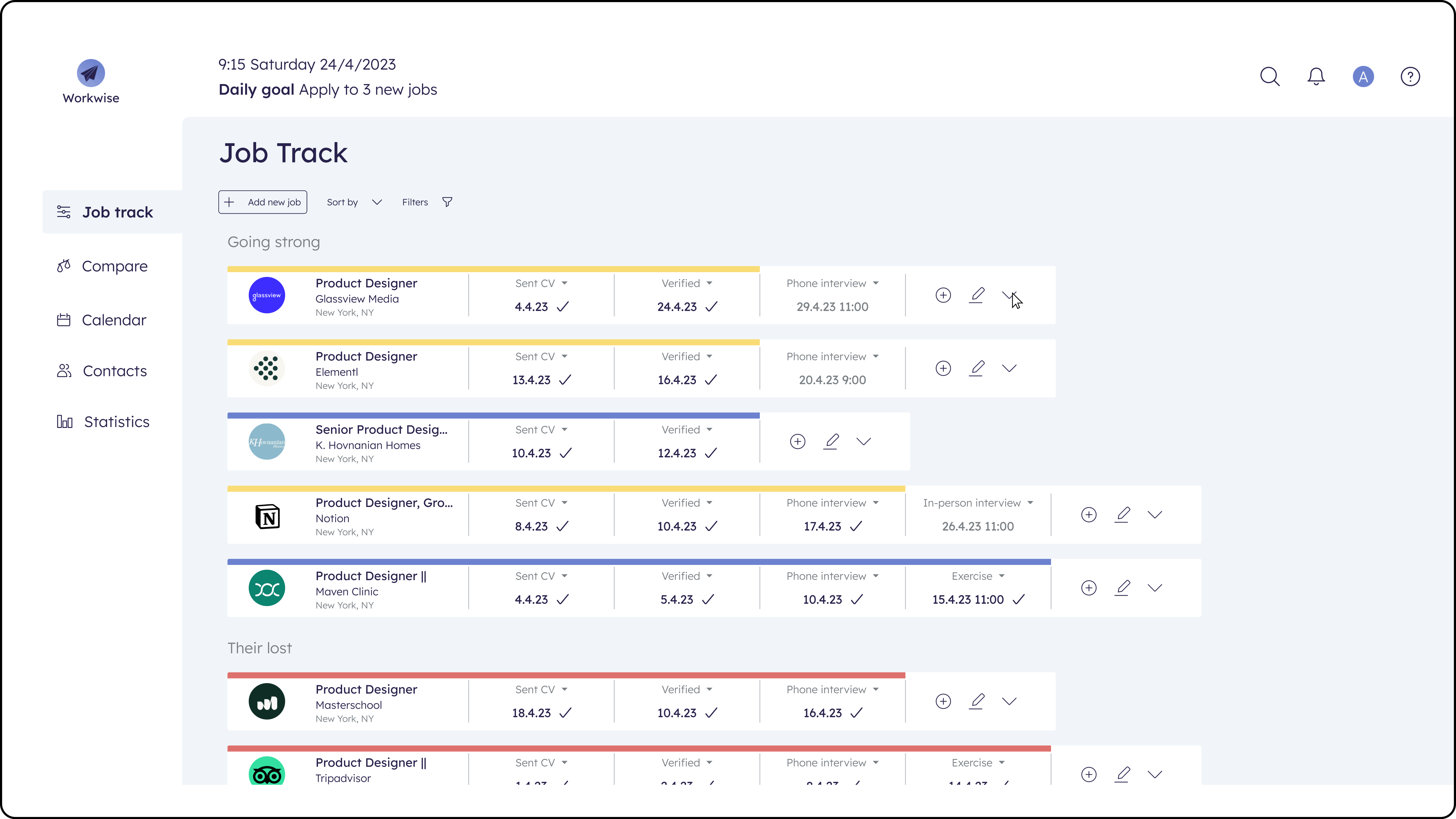
The guidelines set for the design were to keep things as simple as possible both visually and practically to help users understand and control the information overload.
The goal was to make an intuitive, customizable table-like system, that will allow the user to track multiple applications at the same time easily. By using neutral colors as background and bold colors for the progress bar of each job, users can easily focus and identify the state of each application.
Color guide:
Received offer
Pending
Your move
Declined
Different views
As the research showed users fear the information overload very job has two states in order to show only the essentials as a default state, and allow the user to see more information in the extended view.
There are also links to see further information at the original site / company site.


This helps me see more of the important details and control all of the information
Reminders & notifications
First type of notification is set automatically and is for events that have been left behind. The second of notifications are set by the user according to upcoming events

Now I can stay on top of all upcoming events, and feel confident I won't miss any important deadlines!
Templates

Examples for types of templates for different events (after clicking the button for adding a new event):


Status change
when the user makes or changes an event the statues changes automatically.
But there's always an options to change manually to make sure the progresses presented correctly even if not to the automatic default. This function will be used mostly in the final stage to show if an application has been accepted or declined.

The different colors helps me instantly identify the status of each process and understand to do next.
05
Notes and thoughts
a. One major challenge was finding the right balance between a clean, intuitive interface and including all necessary functionality. For the future I have further thoughts regarding the existing features on how to simplify them more and make all the information even more clear and approachable.
b. Another challenge I encountered was making the app's processes shorter and more efficient. It was crucial to simplify the user journey while ensuring the accuracy of the information. Through focused work on refining the user flow, my goal was to create an experience that saves users' time without compromising the reliability of the provided information.
c. A thought for the future is ensuring more consistency and cohesion in the visual language, involving icons, colors, and text. Harmonizing these elements was crucial, as I found it helpful with the information overload. For example, a change I would like to add to improve user understanding and assist those with color blindness, I suggest adding text when hovering over the progress bar to indicate its color and meaning.
d. I would also like to explore additional features that were not included in the main user flow that could enhance the application's value. For example, comparing between multiple job processes and offers to help the user decide on the next step in his/her career.
